Behind the scenes on Surfer Magazine’s ‘Big Issue’
- Text by Michael Fordham
- Photography by Surfer Magazine
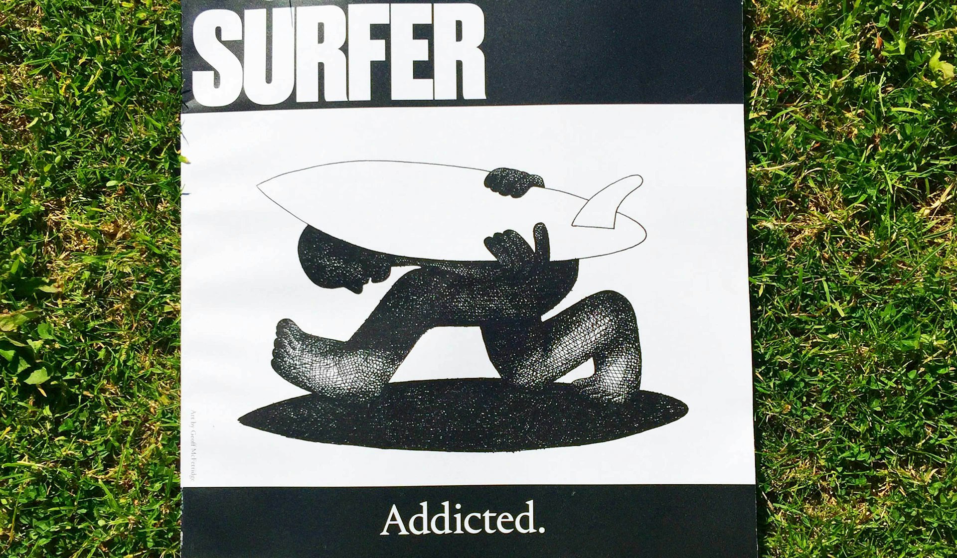
When Surfer Magazine recently launched its annual ‘Big Issue’ with a new masthead and a stunningly original cover featuring nothing but a brilliant Geoff McFetridge piece, it created a stir in mainstream surf culture. Behind the refreshing change of beat is Art Director James Newitt. We hit up the Devonian émigré at his home in San Diego.
As Art Director of Surfer Magazine, do you have a role in the wider culture?
Perhaps by default, by mere fact that the magazine will always be the original surfing magazine. Even with the decline of print Surfer is still revered. I think that’s partly down to the permanence of print versus digital. I don’t know if my role is a particularly pivotal one, but it was always my wish to just contribute somehow to the culture through my work whatever I might be doing.
How did the idea emerge for the McFetridge cover? What was the commissioning process?
When I started the job, Geoff was one of the first outside people I wanted to work with. Actually, years ago, when I was just starting out as a designer he kindly contributed to a crappy little surf fanzine I was making. At the time, I was amazed he even bothered, but he is – like a lot of artists, I’ve found – very humble and generous. It was nice all these years later to invite him contribute to Surfer. I’d been working with Geoff to produce some illustrations for a regular column in the magazine, and the cover commission extended from that.
Art is a big part of the Surfer’s history (founder John Severson is an artist, Rick Griffin its most famous contributing artist), but there hadn’t been an art cover in some time. Traditionally, they are harder to sell than say an action shot, and deemed more risky, I suppose. But to me, Geoff is a modern master. He is a prolific artist and adept at drawing conceptually. He’s able to interpret sometimes complex ideas in a brilliantly simple way, which universally appeals.
Of course, Geoff is a surfer himself too, which was essential to understanding the brief. He had actually already produced a piece that conveyed the theme of the issue (“Addiction”) but we asked him to do a new rendition using paint, which he gladly did. When it came it didn’t quite have the resonance as the original. Geoff even conceded he couldn’t better the original. So in fact on the day of press we switched out the painting for the original piece, and it just worked.
Its’ a difficult commission for any artist, very different to creating a piece for their own sake. As art director you have to be really careful in guiding the thing; too much direction can be stifling, not enough and it can go awry with heavy consequences. But generally, the more freedom artists have, the more they thrive and produce their best work, so my part becomes about finding that balance with them, and facilitating the art, which is an art in and of itself.
How do people react at the heart of ‘the belly of the beast’ to you as an English surfer?
I don’t know that people know, or care that I’m English. But occasionally, I feel like a bit of an impostor. The magazine is essentially rooted in America after all. But honestly, its not as unusual as it might have once been to be an English surfer. I think British surf culture has come of age in the last decade or so, and now grows independent from the U.S and Australia. Living abroad, I’m immensely proud to come from England, and for the start it gave me in surfing, it a big part of my identity, I think.
Surfing is so diverse and broadly dispersed these days. Is it difficult to find a defining aesthetic?
It seemed to me that action sports magazine design (in America, at least) was heavily influenced by advertorial design, which is of course seasonal (fashion-led), it changes constantly. To the extent that the magazines were trying to stay on trend and compete for the attention by re-inventing themselves issue to issue, feature to feature even, sometimes at a cost to the reading experience, I felt. Whereas, the magazines I admired most were those longstanding titles, that had in place a kind of style that endured and ultimately served to foreground the content.
Surfer’s history and heritage is arguably its greatest asset, its still the go-to surf publication. I felt like the design should be similarly authoritative and stay centred on the message rather than visual titillation. I wanted to create a clear distinction between the edit and the ads, which are regrettably an ever-increasing portion of the magazine, as a matter of survival. So, the front and back of book are ordered and orientating, while the feature embraces a little serendipity, without disrupting the content and narrative flow. But at the risk of overanalysing, its really just a matter of taste and inclination, not one of rules or a rigid system. I can’t say I always get it right, I’ve made plenty of mistakes and have a lot to learn, but learning is enjoyable and fulfilling. I constantly question myself, that’s probably what drives me the most. If you’re not questioning yourself, you’re just trotting out experiences and going around in circles.
Check out Surfer Magazine’s Addicted issue.