Unearthing the old business cards of Chicago gangs
- Text by Miss Rosen
- Photography by Brandon Johnson, Courtesy Almighty, Insane Books

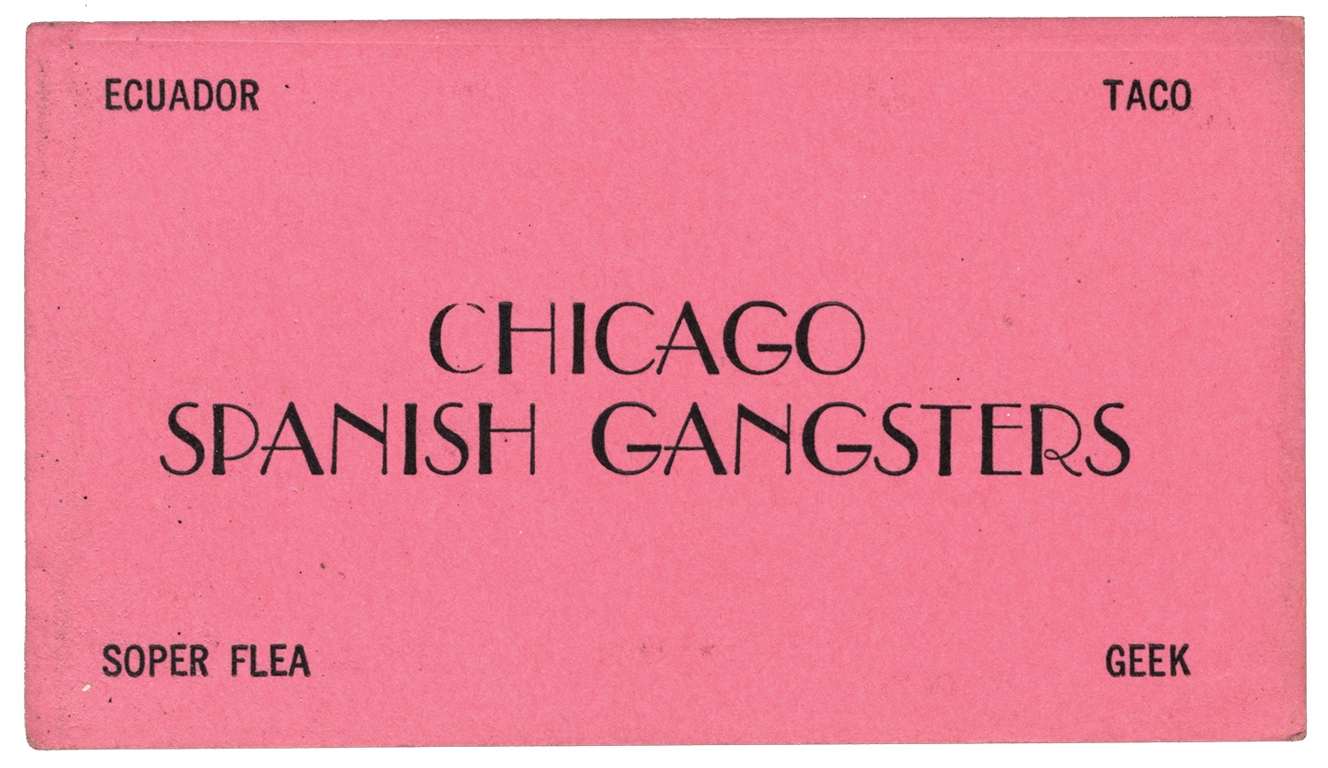
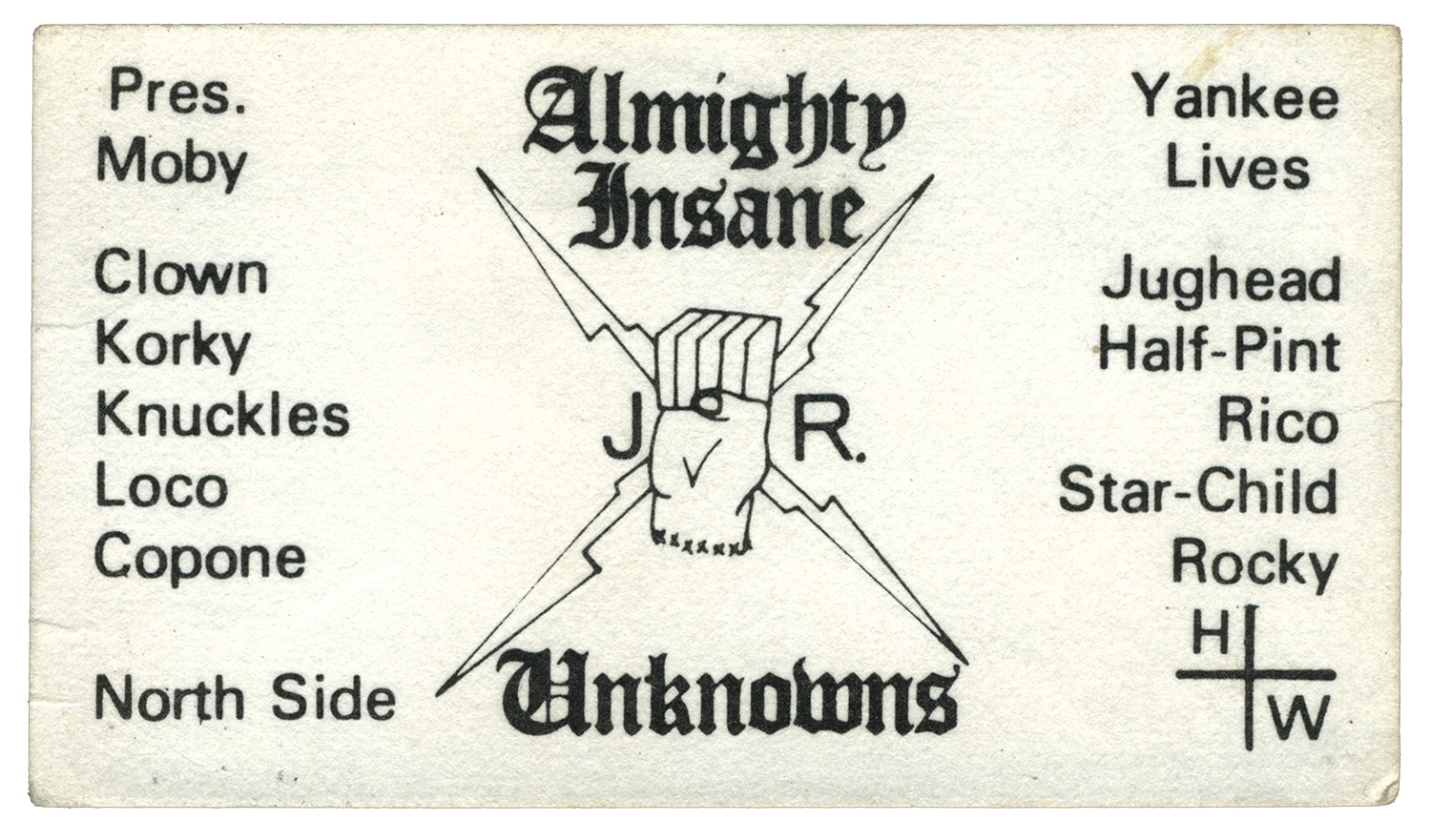
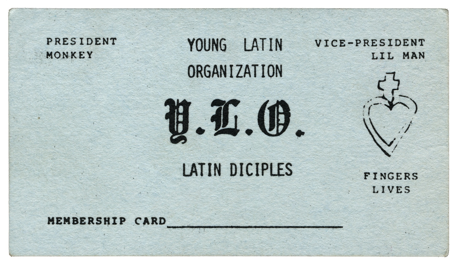
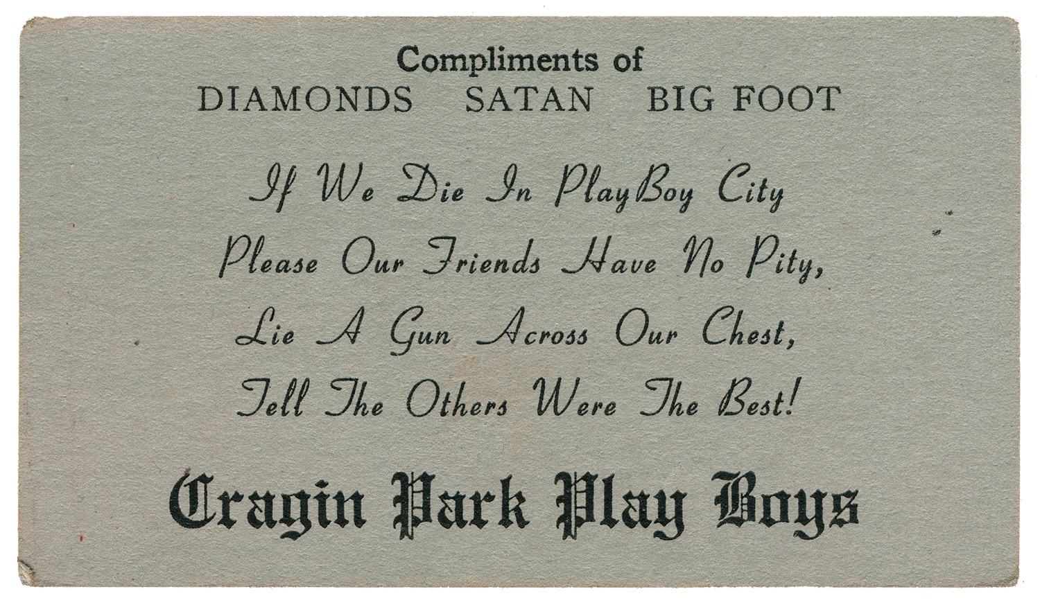
Long before digital media took hold, people built their reputations through business cards. Offering the perfect balance of professionalism and panache, these cards communicated the holder’s identity to friends, associates, and enemies with bold, blackletter typefaces.
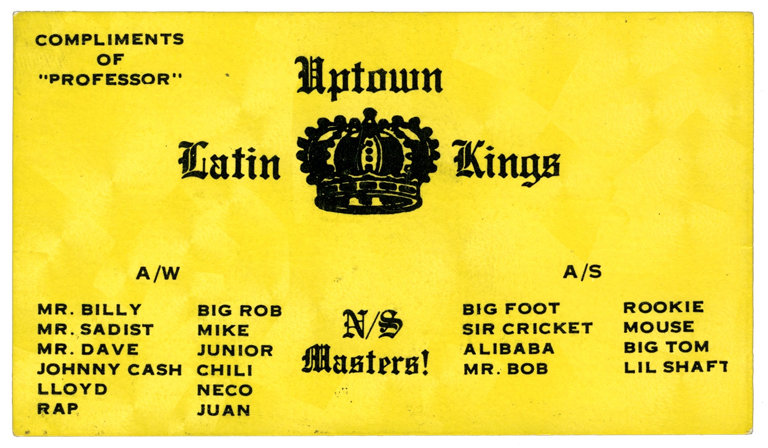
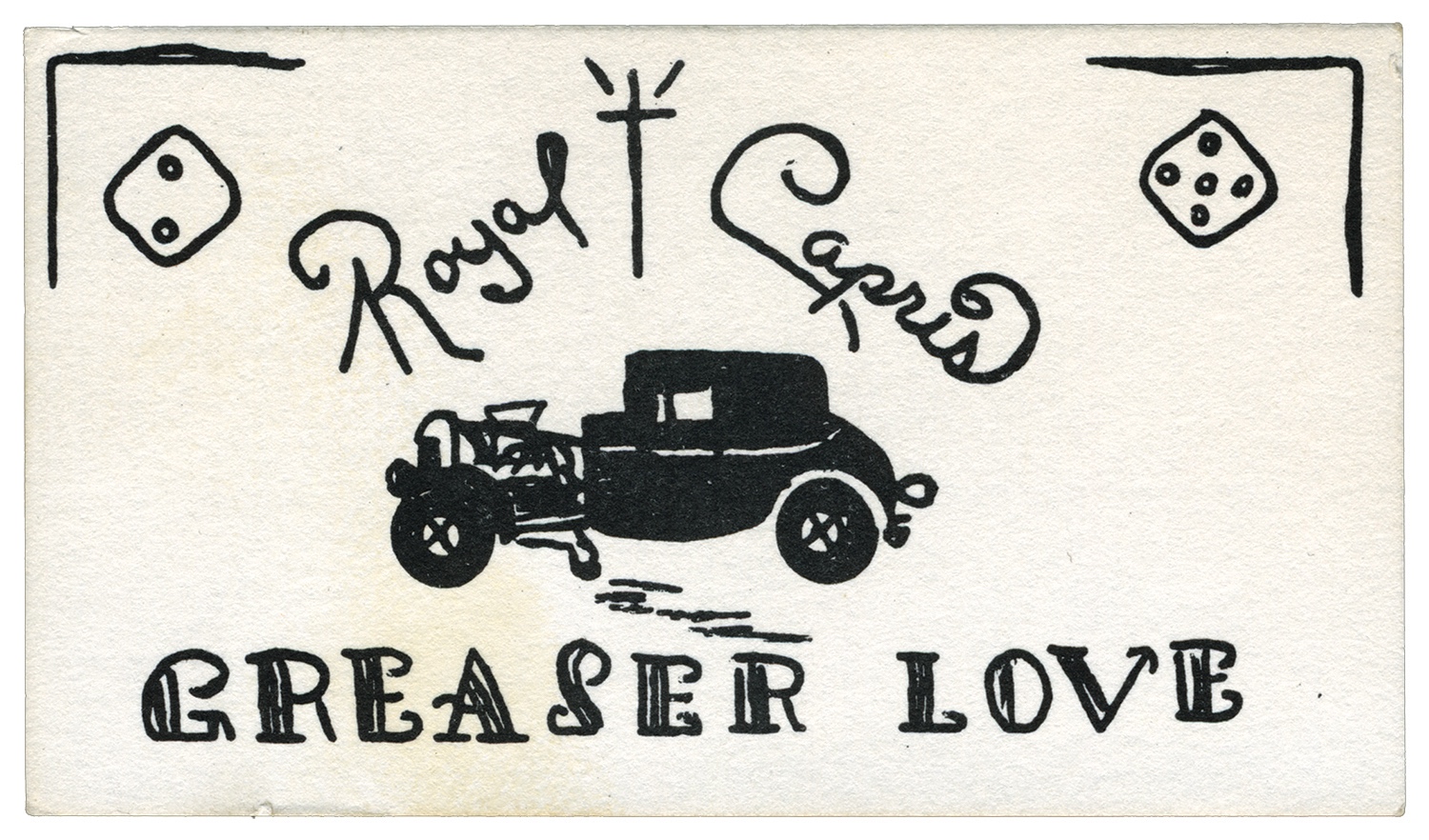
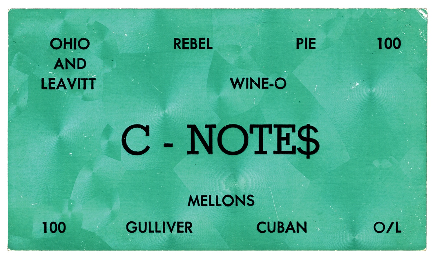
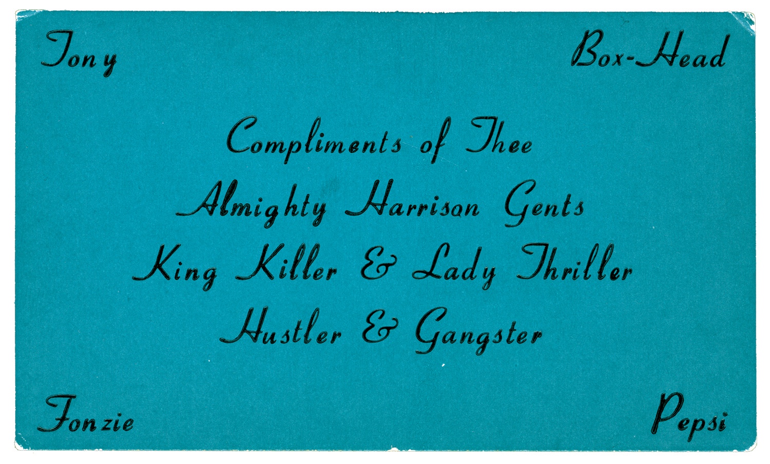
On Chicago’s North and West Sides during the 1960s and 70s, business cards were one of the ultimate status symbols for gangs like the Royal Capris, the Almighty Playboys, and the Imperial Gangsters, who used these discreet slips of paper to rep their set.
“The practice carried over from membership cards of social athletic clubs in Chicago that many gangs evolved from,” says Brandon Johnson, author of Thee Almighty & Insane: Chicago Gang Business Cards From the 1960s & 1970s – his second in-depth volume documenting the long-underground culture. “In my opinion, these cards offered the gangs a sense of validation as official organisations.”
The book features over 70 reproductions of original cards drawn from Johnson’s spectacular, decade-in-the-making collection. At the time, they were used to establish a gang’s name, territory, and members – but they also speak of a time where political leanings were displayed without fear or remorse so that you knew what you were up against if you ended up on foreign turf.
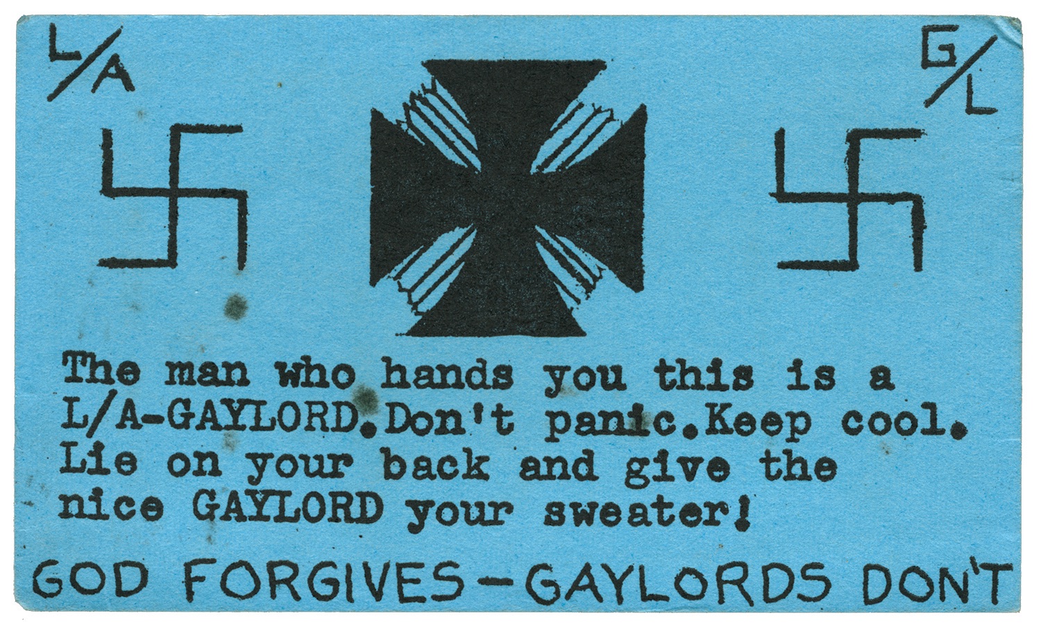
“Cards from the 1970s often reflected the strife and cultural nationalism, with slogans of racial pride and racial slurs,” Johnson says. “For example, the widespread Almighty Gaylords, who opposed newcomers and utilised hateful words and symbols on their cards to do so.”
The Gaylords emblazoned their cards with swastikas and the warning: “The man who hands you this is a L/A GAYLORD. Don’t panic. Keep cool. Lie on your back and give the nice GAYLORD your sweater!” – a reference to the cardigan-style sweaters with embroidered patches of the names and symbols of their clubs that gangsters proudly wore.
“I’ve definitely been in contact with some interesting characters from this world,” Johnson says of the various retired gang members, card designers, record shop owners he has met over the years. “I think the first book made people see more historical value in them, and be less likely to let anything go.”
Thee Almighty & Insane: Chicago Gang Business Cards From the 1960s & 1970s is out now.
Follow Miss Rosen on Twitter.
Enjoyed this article? Like Huck on Facebook or follow us on Twitter.
You might like

Moshpits & kickflips at the Volcom Garden Experience 2026
Family affair — Last weekend, the skate, surf and snow culture brand hosted a free mini festival in its European backyard of Biarritz. We went along and chatted to legendary artist and surfer Ozzie Wright.
Written by: Isaac Muk

A luminous portrait of Black life over six decades
Shared Memories — As staff photographer for The New York Times, Chester Higgins captured Black culture and spiritual connection like no other. A new exhibition celebrates his life and impact.
Written by: Miss Rosen

In photos: Washington DC’s Black communities facing up to gentrification
A Language We Share — A new exhibition featuring the work of Beverly Price and Gordon Parks preserves historically Black neighbourhoods in the USA, before development and economic forces made them disappear.
Written by: Miss Rosen

Horst Festival is a blueprint for a creative, collective future
Hymn — Highlighted by an engrossing performance directed by Fallon Mayanja, the 2026 edition was a showcase of ASIAT Park’s ever-evolving space as an incubator for art, music and creativity.
Written by: Isaac Muk

Venice Biennale will not award artists from Israel & Russia due to war crime accusations
Art Not Genocide — Both countries will still be allowed to exhibit work at their respective pavilions, but be excluded from judging considerations, as they have leaders facing arrest warrants issued by the International Criminal Court.
Written by: Noah Petersons

“I didn’t care if I got sacked”: Sleazenation’s Scott King in conversation with Radge’s Meg McWilliams
Radgenation — For our 20th Anniversary Issue, Huck’s editor Josh Jones sits down with the legendary art director and the founder of a new magazine from England’s northeast to talk about taking risks, crafting singular covers and disrupting the middle class dominance of the creative industries.
Written by: Josh Jones
